
Fumado Mobile App
UX / UIFumado Brazilian Steakhouse is a fictional national dining brand known for its specialty Brazilian-inspired pizzas, healthy side dishes, and broad, competitive pricing. For this project, I designed a mobile ordering experience that captures the warmth and richness of the brand while making it effortless for customers to browse the menu, customize orders, and check out smoothly. My focus was on blending an elevated visual identity with a streamlined, intuitive user flow that reflects Fumado’s commitment to quality and convenience.
Click below to view my research
-
I was responsible for designing the mobile ordering experience for Fumado, creating intuitive user flows for browsing menu items, customizing orders, and completing checkout with minimal friction.
I developed the visual language for the app, including color, typography, iconography, and layout patterns that reflect the brand’s Brazilian-inspired identity.
I produced wireframes, high-fidelity mockups, and interactive prototypes.
-
Designing for a fictional national brand required crafting a digital identity from scratch—balancing Brazilian cultural cues with a clean, modern interface.
The menu included specialty pizzas, sides, and diverse pricing options, making it challenging to organize content without overwhelming users.
Ensuring the ordering experience remained fast and accessible while accounting for customization, add-ons, and dietary preferences.
-
Create a mobile ordering experience that feels seamless, clear, and delightful for first-time and returning customers.
Build a flexible design system that could scale with new menu categories, promotions, and locations.
Translate Fumado’s mission—delivering flavorful, healthy food—into an interface that feels warm, trustworthy, and easy to navigate.
Research Goals
Upon receiving the prompt, I was cognizant of the complexities. Therefore, I deconstructed the prompt into subproblems, which I tackled by using research goals.
The who, what, where, and why affected by long restaurant lines.
What tools and methods are used to succeed in restaurant order flow?
What are some of the hesitancies behind mobile order functions?
How does mobile food orders help an individual and a restaurant?
Problem Statements
I put together some basic problem statements to better understand the pain points with the purchasing/renewal process.
Mindy
Mindy is a Academic counselor at a university who needs to find a local restaurant that can provide quick and easy service through a mobile app due to a lack of time during the day to prepare one.
Jim
Jim is a single parent with two boys who needs to find a local restaurant that can provide quick service but also offer rewards for promos and discounts because he is on a budget.
Persona’s
Goals
Remove extra time, work through saved selections and location preferences.
Add in location function to give user options for mobile orders to be either: dropped off at customer location, or picked up at store location.
Allow the user to see when the order is being made and notified when the order is ready.
Add more customization for the user throughout the order process.
In most cases, the mobile order function does not give a user the ability to customize the order for food allergies, removing a side meal, etc.
Add in filter options for additional ordering options based on; popular items, healthy items, and pricing.
Allow the mobile app to offer the option of a multilingual function.
Initial Ideation
Usability Study
Research Questions
How long does it take for a person to order a food item through the app?
What can we learn from the user flow, or the steps that users take when navigating through the app?
Participants
5 Participants
Two males and two females and one non-binary individual between the ages of 25 to 75.
Methodology
10 minutes per participant.
Test conducted in the United States, remote.
Users were asked to perform tasks in a low-fidelity prototype.
Digital Wireframes
Link to low-fidelity prototype:
Insights
It was observed that 3 out of the 5 participants mentioned wanting custom order options to be added to the app and wanted more information regarding the benefits of becoming a member before signing up through the app.
Full themes observed from the study
Below are some notable comments from the participants:

I was overwhelmed by the number of choices on the sheet. When I finally got to the page I felt like I was being tracked and my privacy was compromised.
The checkout was easy to follow, but I wish there were more options for my order option.
No problems in finding the profile page. Wish there were more specifics in the sign-up process so I knew what was coming my way as a member.
Affinity Map
Below is an affinity map that I collected from the Usability Study to help gather qualitative information about the users and group their experience by category.
Recommended Updates
Make it possible for users to include a customized order option so they can mention any food allergies or food additions/subtractions.
Include a detailed confirmation receipt to the customer before they place the order
Display incentives to customers on profile page for rewards sign up.

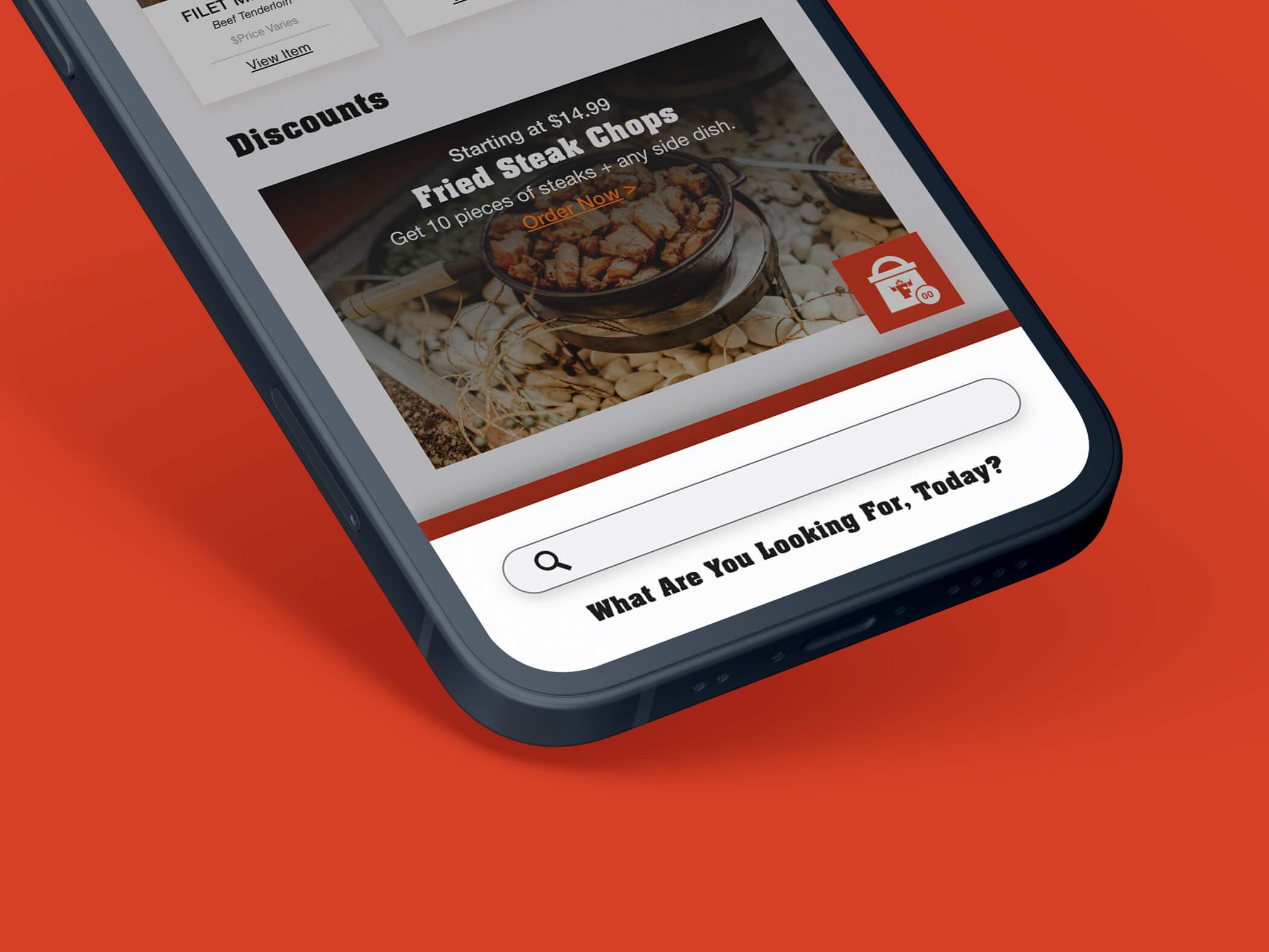
Final Deliverable
Brand Color Scheme
Creating a brand color scheme is about selecting an appropriate set of colors that match the brands mission and the subconscious energy the color gives off to the user. In the case of UI design, the use of the brands colors is just as important. Contrast, balance, and color harmony matter in visual design. In this case, I wanted to find ways to use a monochromatic color scheme of orange to evoke excitement and warmth to match best practices of UI.


Want to see my full study into the Fumado Mobile App?
Click the button below to view: