Pearl Gowns
LOGO I BRANDPearl Gowns is a small boutique business located in Creswell, OR. Pearl Gowns’ mission is to provide elegant/custom dresses - without stretching the wallet. The start-up company approached me to help design their logo ‘from scratch’.
-
Design logo options, create a presentation; and make a brand guideline for the client.
-
Design a brand style that appealed to a demographic of young women (age 12-24)-while blending nostalgia with the modern.
-
Create an experience for the customer to feel as though they are purchasing an expensive dress for half the cost.
Early Drafts
During this phase, I am slowly weeding through ideas to best fit the client’s needs by combining research from other competitors and collecting brand strategies from similar successful businesses.
Wordmark
My research and concept creation led me down a path to the final decision of using a wordmark for the logo. By using a text-only typographic treatment of the business name to make it identifiable as the brand identity or logo, aided the company in being identified as a high-end service and quality that presented trust to a customer. The wordmark also ties into the theme of taking from history and tying to modern day by paying homage to Art Deco style of typography and design.
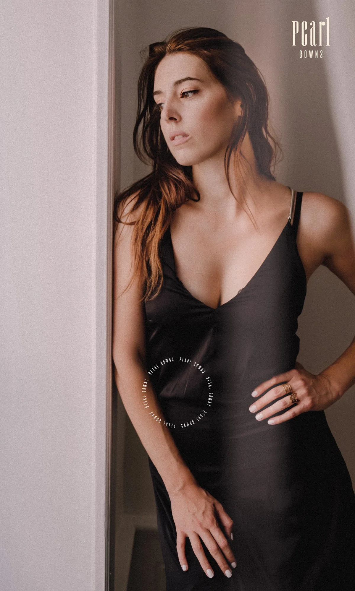
Example photography
Example photography


