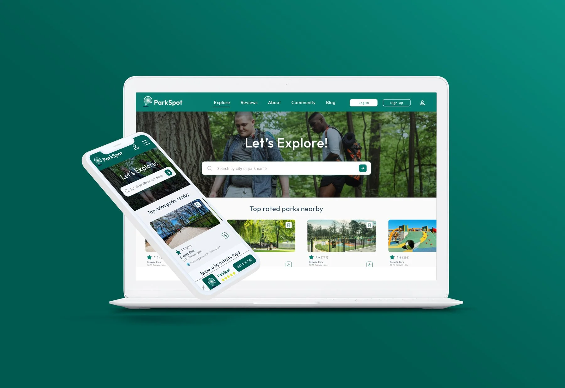
ParkSpot App & Website
UX / UIParkSpot is a fictional public parks app and website in the United States. ParkSpot’s goal is to help communities find new and existing public parks by enabling location settings for families and individuals. By giving them access to a website and offline mobile app, families and individuals can find a public park for all their needs. Below is the UI design and UX research work that I did.
-
Conducting interviews, paper and digital wireframing, low and high-fidelity prototyping, conducting usability studies, accounting for accessibility, and iterating on designs.
-
At the city level, researchers have long confirmed that park access is unequal. The size and location of parks can vary greatly from place to place, and a third of Americans in the 100 largest cities are more than a 10-minute walk from a park. City residents may also remain disconnected from parks depending on their income, education, and race. (Brookings.edu).
-
The goal of ParkSpot is to create an experience that would easily connect people and their families to new and existing public parks in there area.
Want to see my full study into the ParkSpot app and responsive website?
Click the button below to view:
Research Goals
Upon receiving the prompt, I was cognizant of the complexities. Therefore, I deconstructed the prompt into subproblems, which I tackled by using research goals.
The who, what, where, and why affected by the existing public parks locations.
What tools and methods are used to succeed in public parks access?
What are some of the hesitancies behind going to a public park today?
How does a responsive website and app help an individual and public park attendance?
Problem Statements
I put together some basic problem statements to better understand the pain points with the purchasing/renewal process.
Jason
Jason is a 29 year old, single male working as a realtor in Louisville, KY. Jason likes to stay active outside of work and wants to find the best public parks for recreation and hiking.
Megan and Carlos
Megan and Carlos are two working parents with one daughter. Megan is a strategist at a local advertising firm and Carlos is an analyst at a tech startup company. To make more enjoyable memories with their daughter, they want an app and website that can show reliable reviews for any park that may not be safe for them.
Persona’s
Goals
Remove extra time, work through saved selections and location preferences.
Add in contact information with local parks department for any additional questions an individual may have about the parks.
Allow the user to find a park by category, such as; most popular, security, hiking, running, biking, etc.
Add more customization for the user to filter through public park options.
let users filter through park options by location, activities, safety, family-friendly, handicap accessibility and top-rated.
Add in option for individuals to provide reviews of parks that they visit and post to ParkSpot website or app.
Allow the app to function offline incase individual goes where cellular data is in limited range.
Initial Ideation
Usability Study
Research Questions
How long does it take for a person to select a public park?
What can we learn from the user flow, or the steps that users take when navigating through the app?
Participants
4 Participants
One male, two females and one non-binary individual between the ages of 21 and 75.
Methodology
10 minutes per participant.
Test conducted in the United States, remote.
Unmoderated usability study.
Users were asked to perform tasks in a low-fidelity prototype.
Digital Wireframes
Link to low-fidelity prototype:
Insights
It was observed that 2 out of 4 participants had an uncomfortable tone while recording their interaction with the prototype. This means that for half users, the interaction with the website and app was not a pleasant one. Full themes observed from the study
Below are some notable comments from the participants:

I could not find the "recently viewed" page because the text was too small.
Recently viewed was a nice feature. Just wish it were somewhere more accessible when I am in a hurry.
The profile page was easier to find on the app than the website, in my opinion.
Affinity Map
Below is an affinity map that I collected from the Usability Study to help gather qualitative information about the users and group their experience by category.
Recommended Updates
In general, users wanted an easier way to set their location, upfront. Not wait til they were in a certain park page.
In general, users wanted to be able to activate safety features, or see what the weather was like in the coming days ahead when they might visit a park.
In general, most users wanted to know what incentives they would receive if they signed up for a profile on the app.

Final Deliverable
Brand Color Scheme
Creating a brand color scheme is about selecting an appropriate set of colors that match the brands mission and the subconscious energy the color gives off to the user. In the case of UI design, the use of the brands colors is just as important. Contrast, balance, and color harmony matter in visual design. In this case, I wanted to find ways to use a Analogous color scheme of green and navy blue to evoke nature and calmness to match best practices of UI.


Want to see my full study into the ParkSpot app and responsive website?
Click the button below to view: